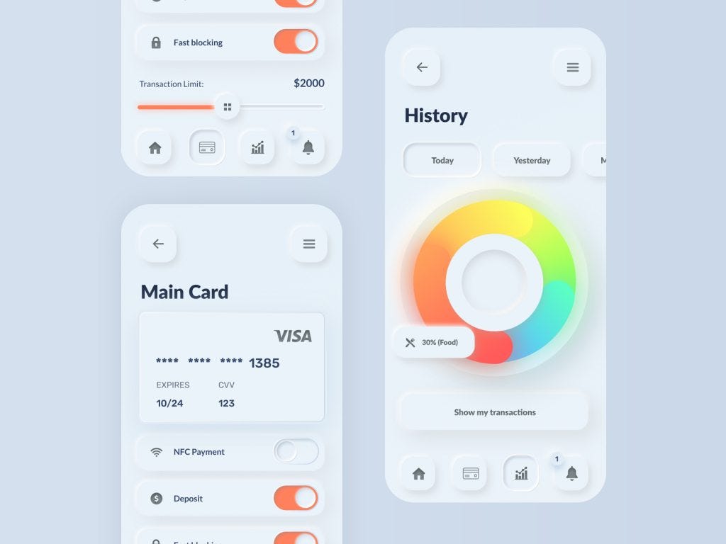
In the ever-evolving world of user interface (UI) design, trends come and go, often in cycles. One design trend that has seen a resurgence in recent years is skeuomorphism. While this term might sound unfamiliar, you’ve undoubtedly encountered it in various digital interfaces. In this blog post, we’ll explore skeuomorphism in UI design, its history, and how it’s making a comeback in modern applications.
What is Skeuomorphism?
Skeuomorphism is a design philosophy that incorporates elements from the physical world into digital interfaces. The goal is to make digital objects resemble their real-world counterparts. Think about the early days of smartphone interfaces when app icons looked like physical buttons or when calendar apps resembled paper planners.
The term “skeuomorphism” itself is a combination of two Greek words: “skeuos,” meaning container or tool, and “morphē,” meaning shape. Essentially, skeuomorphism seeks to mimic the shape or appearance of familiar physical objects to create a sense of comfort and familiarity for users.
A Brief History of Skeuomorphism in UI Design
Skeuomorphism was prevalent in UI design during the early years of personal computing. This design approach made it easier for users to transition from the physical world to the digital realm, as the elements they interacted with felt familiar.
The Apple Era
One of the most famous examples of skeuomorphic design comes from Apple. The early versions of iOS featured realistic textures, gradients, and even faux-leather stitching. Icons for notes looked like yellow legal pads, while the calendar app mimicked a physical desk calendar.
While these designs might seem dated by today’s standards, they played a crucial role in making smartphones and tablets accessible to a wide audience.
The Decline of Skeuomorphism
As technology advanced and users became more accustomed to digital interfaces, there was a shift away from skeuomorphism. Designers started favoring flat design, which embraced minimalism and removed excessive textures and gradients.
This shift was partly driven by the need for responsive design that could adapt to various screen sizes and resolutions. Flat design allowed for greater flexibility and faster loading times, as it relied on simpler shapes and fewer graphical elements.
The Skeuomorphism Resurgence
So, why is skeuomorphism making a comeback in modern applications? Several factors are contributing to this revival:
- Nostalgia
Nostalgia is a powerful emotion, and many users have fond memories of the early days of personal computing. Revisiting skeuomorphic design elements can evoke a sense of nostalgia, which can be a compelling way to engage users emotionally. - Improved Technology
Modern hardware and software can handle more complex graphical elements without sacrificing performance. This means designers can incorporate skeuomorphic elements without compromising usability or speed. - User Engagement
Skeuomorphism can enhance user engagement by providing visual cues that guide users through the interface. For example, a digital bookshelf with realistic book spines can make it easier for users to understand that it’s a library of e-books. - Brand Differentiation
In a crowded app marketplace, skeuomorphic design can help apps stand out. It can give an app a unique identity and make it memorable in users’ minds.
Examples of Skeuomorphism in Modern Applications
Let’s take a look at some real-world examples of skeuomorphism in modern applications:
- Calendar Apps
Many calendar apps have returned to a design that resembles physical planners, complete with realistic page-turning animations and textured backgrounds. These design choices make users feel like they’re interacting with a physical calendar while enjoying the convenience of digital scheduling. - Note-Taking Apps
Some note-taking apps use skeuomorphic design to recreate the experience of writing on a physical notepad. They might include lined paper backgrounds, pen-like writing tools, and even sound effects to mimic the act of writing on paper. - E-Book Readers
E-book reader apps often incorporate skeuomorphic elements, such as virtual bookshelves, realistic page-flipping animations, and book covers that resemble physical books. This design approach makes reading on a digital device feel more like reading a traditional book.
Best Practices for Using Skeuomorphism
If you’re considering incorporating skeuomorphic elements into your UI design, here are some best practices to keep in mind:
- Balance Realism with Functionality
While it’s tempting to make everything look hyper-realistic, remember that functionality should remain a top priority. Skeuomorphic elements should enhance the user experience, not hinder it. - Consider User Preferences
Not all users will appreciate skeuomorphic design. Some prefer a more minimalist and flat UI. Consider offering users the option to switch between different design styles to cater to a broader audience. - Performance Optimization
Ensure that your skeuomorphic design doesn’t negatively impact performance. Graphics should be optimized for various devices and screen sizes to maintain a smooth user experience. - Stay Consistent
If you decide to embrace skeuomorphism, maintain consistency throughout your UI. Inconsistencies in design can confuse users and diminish the overall user experience.
Conclusion
Skeuomorphism in UI design is making a comeback, bringing a sense of nostalgia and familiarity to modern applications. When used thoughtfully and in moderation, skeuomorphic elements can enhance user engagement and provide a unique identity to your app. As technology continues to evolve, it’s exciting to see how designers will blend the best of the digital and physical worlds to create compelling user experiences.


