Introduction
Nonprofit organizations and fundraising platforms play a vital role in addressing various social, environmental, and humanitarian issues. To succeed in their missions, these organizations rely on the generosity and support of donors and volunteers. One of the key factors that can significantly impact their success is the user interface (UI) of their digital platforms.
In today’s digital age, an intuitive and visually appealing UI is essential for nonprofits and fundraising platforms to connect with their audience effectively. In this article, we will delve into the importance of UI design for nonprofits and provide insights into building a compelling UI that maximizes engagement and donations.
Understanding the Role of UI in Nonprofits
The user interface of a nonprofit or fundraising platform serves as the gateway through which donors, volunteers, and supporters interact with the organization. It plays a pivotal role in conveying the organization’s mission, building trust, and encouraging visitors to take meaningful actions, such as making donations or getting involved.
Reflecting Your Brand Identity: Your nonprofit’s brand identity should be well-represented through the UI. This includes using consistent colors, fonts, and imagery that align with your organization’s values and mission. A cohesive brand identity fosters recognition and trust among your audience.
Emphasizing User-Friendly Navigation: Navigation should be intuitive and straightforward. Donors should easily find information about your cause, ongoing projects, and how to contribute. Clear and organized menus, search functionality, and a user-friendly layout are essential.
Compelling Visuals and Storytelling: Incorporating impactful visuals, such as images and videos, can help convey your organization’s impact. Share stories of individuals who have benefited from your work to create an emotional connection with your audience.
Mobile Responsiveness: With an increasing number of users accessing websites and apps via mobile devices, it’s crucial to ensure that your UI is responsive and provides a seamless experience on various screen sizes.
Accessibility: Make sure your UI is accessible to all users, including those with disabilities. Follow web accessibility guidelines to ensure that everyone can access and navigate your platform.
Designing for Donor Engagement
Donor engagement is the lifeblood of nonprofit organizations. An engaging UI can significantly impact the willingness of visitors to contribute and support your cause. Here are some design strategies to enhance donor engagement:
Clear Call-to-Action (CTA) Buttons: Use visually prominent CTA buttons that guide visitors to take specific actions, such as “Donate Now” or “Join Our Cause.” These buttons should stand out and be strategically placed on your platform.
Personalized User Journeys: Implement personalization techniques to tailor the user experience based on individual preferences and past interactions. This can include showing recommended donation amounts or suggesting relevant projects to support.
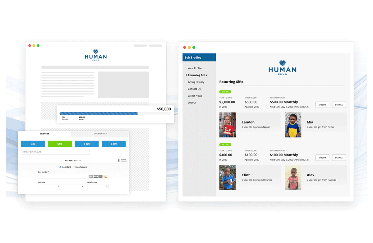
Progress Bars and Milestones: Display progress bars to show how close you are to achieving specific fundraising goals or completing projects. Milestones create a sense of accomplishment and urgency, motivating donors to contribute.
Interactive Impact Reports: Provide donors with real-time updates on the impact of their contributions. Interactive charts, graphs, and infographics can visually convey the difference their donations are making.
Building a Community
Nonprofits thrive when they build a sense of community among their supporters. Your UI can play a significant role in fostering this sense of belonging and collaboration.
Social Media Integration: Incorporate social sharing buttons and feeds to encourage supporters to share your organization’s updates and events with their networks. Social media can amplify your reach and engage new donors.
Discussion Forums and Chat Features: Create spaces for supporters to interact with each other, share their experiences, and discuss the organization’s work. This sense of community can deepen their connection to your cause.
Volunteer Sign-Up and Event Registration: Make it easy for individuals to sign up for volunteer opportunities and register for events directly through your platform. Streamlined processes enhance the user experience and increase participation.
User-Generated Content: Encourage supporters to share their stories and experiences with your organization. Highlight user-generated content on your platform to showcase the impact of your work and build trust.
Measuring UI Success
To ensure that your UI design is effective, it’s essential to regularly monitor and analyze its performance. Key performance indicators (KPIs) to track may include:
Conversion rates (donations, sign-ups, etc.)
Bounce rates and time spent on the platform
Click-through rates on CTAs
User feedback and satisfaction surveys
Growth in donor and volunteer numbers
By continuously evaluating these metrics, you can make data-driven adjustments to your UI to optimize its impact on your nonprofit’s goals.
Conclusion
Building a user-friendly and engaging UI for nonprofit and fundraising platforms is a multifaceted endeavor that requires careful planning, creativity, and a deep understanding of your audience. When done right, a well-designed UI can transform your digital presence into a powerful tool for advancing your mission, attracting donors, and building a thriving community of supporters. Remember that the key to success lies in continuously evolving your UI to meet the changing needs and expectations of your audience and the nonprofit landscape as a whole.


