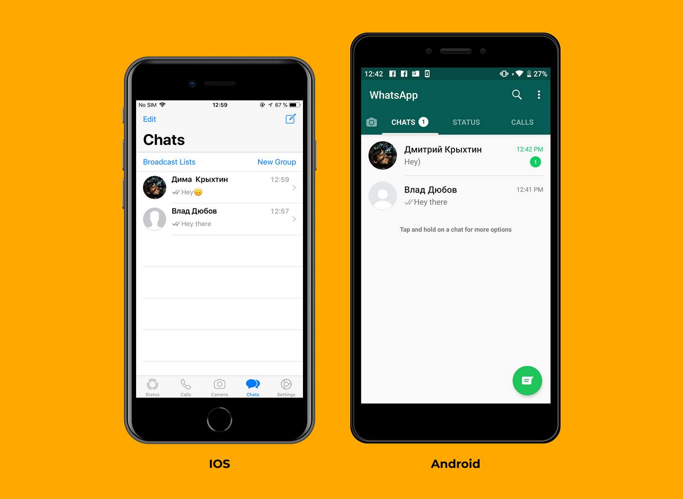
In a rapidly evolving technological landscape, the demand for cross-platform applications has soared. Users expect seamless experiences across various devices, whether it’s a smartphone, tablet, desktop, or even a smartwatch. To meet these expectations, designing a user interface (UI) that works harmoniously across platforms is essential.
Why Cross-Platform UI Design Matters
Cross-platform UI design is about more than just making your app look good; it’s about ensuring a consistent and intuitive user experience across different devices and operating systems. Here’s why it matters:
- Reach a Wider Audience
When you design your UI to be cross-platform compatible, you can reach a larger audience. Your app becomes accessible to users regardless of whether they use iOS, Android, Windows, or any other platform. This broader reach can lead to increased user engagement and business growth. - Save Time and Resources
Developing separate UIs for different platforms can be time-consuming and costly. Cross-platform UI design allows you to streamline the development process, saving valuable time and resources. You can maintain a single codebase while catering to multiple platforms, reducing development and maintenance overhead. - Enhance User Experience
Consistency in UI design contributes to a better user experience. When users switch between devices and find a familiar interface, they are more likely to feel comfortable and confident while using your app. A seamless experience can lead to increased user retention and satisfaction.
Now that we understand the importance of cross-platform UI design let’s explore some key strategies and tips for designing UIs that work well across various platforms:
- Responsive Design is Key
Responsive design is at the heart of cross-platform UI design. It involves creating UI elements that adapt to different screen sizes and orientations. To achieve this, consider the following:
Grid Systems: Implement a flexible grid system that adjusts the layout based on the available screen real estate. Use percentage-based widths and relative units like “em” or “rem” for fonts and spacing.
Media Queries: Use CSS media queries to apply different styles based on screen size. This allows you to optimize the UI for each device type without the need for separate codebases.
Flexible Images and Icons: Ensure that images and icons scale appropriately. Use vector graphics or multiple versions of images to accommodate various screen resolutions.
- Consistency in Design Elements
Consistency is vital for a cohesive user experience. Regardless of the platform, users should encounter familiar design elements. Here’s how to achieve consistency:
Follow Platform Guidelines: Familiarize yourself with the design guidelines of the platforms you’re targeting, such as Material Design for Android and Human Interface Guidelines for iOS. Adhering to these guidelines ensures your app feels native on each platform.
Use a Unified Color Palette: Maintain a consistent color scheme throughout your app. Create a style guide that specifies color codes for various elements like buttons, text, and backgrounds.
Standardize Navigation: Keep navigation patterns consistent. Use common navigation elements like tabs, menus, and buttons in a way that’s familiar to users on each platform.
- Adaptive Typography
Text is a fundamental part of any UI, and it needs to be readable and visually appealing on all devices. Consider the following when working with typography:
Font Scaling: Use responsive font sizes that adapt to different screen sizes. Avoid fixed font sizes that may appear too small or too large on certain devices.
Line Length and Spacing: Adjust line length and spacing to ensure text remains legible, especially on smaller screens. Too much text crammed into a small space can be overwhelming.
Font Selection: Choose fonts that are available on all platforms and are easy to read. Some fonts may not be available on certain devices, leading to inconsistencies in your UI.
- Test Extensively on Real Devices
Testing is a crucial phase of cross-platform UI design. Don’t rely solely on emulators or simulators; test your app on real devices to ensure it performs as expected. Real devices may reveal nuances and issues that emulators can’t replicate.
Device-Specific Testing: Pay special attention to device-specific behaviors, such as how touch gestures work, and how the app responds to different screen sizes and resolutions.
User Feedback: Gather feedback from users on various platforms during the testing phase. Their input can help you identify and address platform-specific issues.
- Leverage Cross-Platform Development Frameworks
Consider using cross-platform development frameworks like React Native, Flutter, or Xamarin. These frameworks allow you to write code once and deploy it on multiple platforms, making it easier to maintain a consistent UI.
Native Modules: While cross-platform frameworks provide a unified codebase, they also allow you to implement platform-specific features when necessary. This flexibility can be valuable for optimizing the user experience.
In conclusion, designing a cross-platform UI is essential for reaching a broader audience, saving time and resources, and providing a consistent user experience. By implementing responsive design, maintaining consistency in design elements, optimizing typography, and thorough testing, you can create a UI that shines on every platform. Embrace the world of cross-platform UI design, and watch your app thrive across various devices and operating systems.


